MASTER MAKEOVER
By Chris Wadsworth
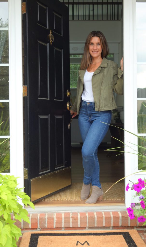
When the Dalvi family in Ashburn’s Loudoun Valley Estates neighborhood wanted to give their home a makeover, they turned to one of the area’s favorite decorators — Angelee Marques of Nest Interior Décor in Ashburn.
The home was redone and refreshed from top to bottom. One of the final rooms to undergo a transformation was the master bedroom. The original master was dark, chopped up and lacked pizazz. So Marques put her thinking cap on and designed a soothing place where the Dalvis could relax and unwind in a calm and cohesive space.
Marques shared some before and after photos, and we interviewed her about the process. Here are portions of that conversation.
Ashburn Magazine: First, let’s talk about the fireplace.
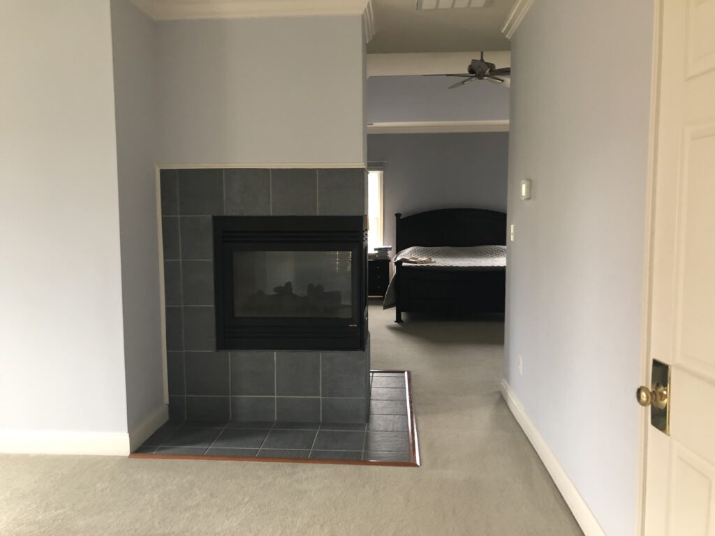
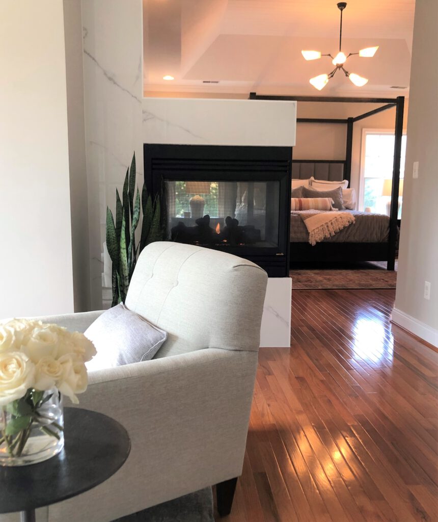
Angelee Marques: “I am so pleased with the fireplace results. It unexpectedly became the element that tied the rooms together. The original fireplace felt like a big barrier between the sitting room and master bedroom and blocked a lot of the natural light that comes in from the sitting room’s exposure. I wanted to open the wall but keep the fire element. In addition, the original fireplace tile extended to the floor and had to be removed to accommodate the hardwood floor going in, which opened the possibility to reface the fireplace. I wanted the fireplace to feel sculptural and by using the large format, thin porcelain tile, we were able to create the look of a slab wrap without the thickness or cost of buying a slab.”
Tell us about the four-poster bed. It’s very modern, no canopy. What is the effect of that?
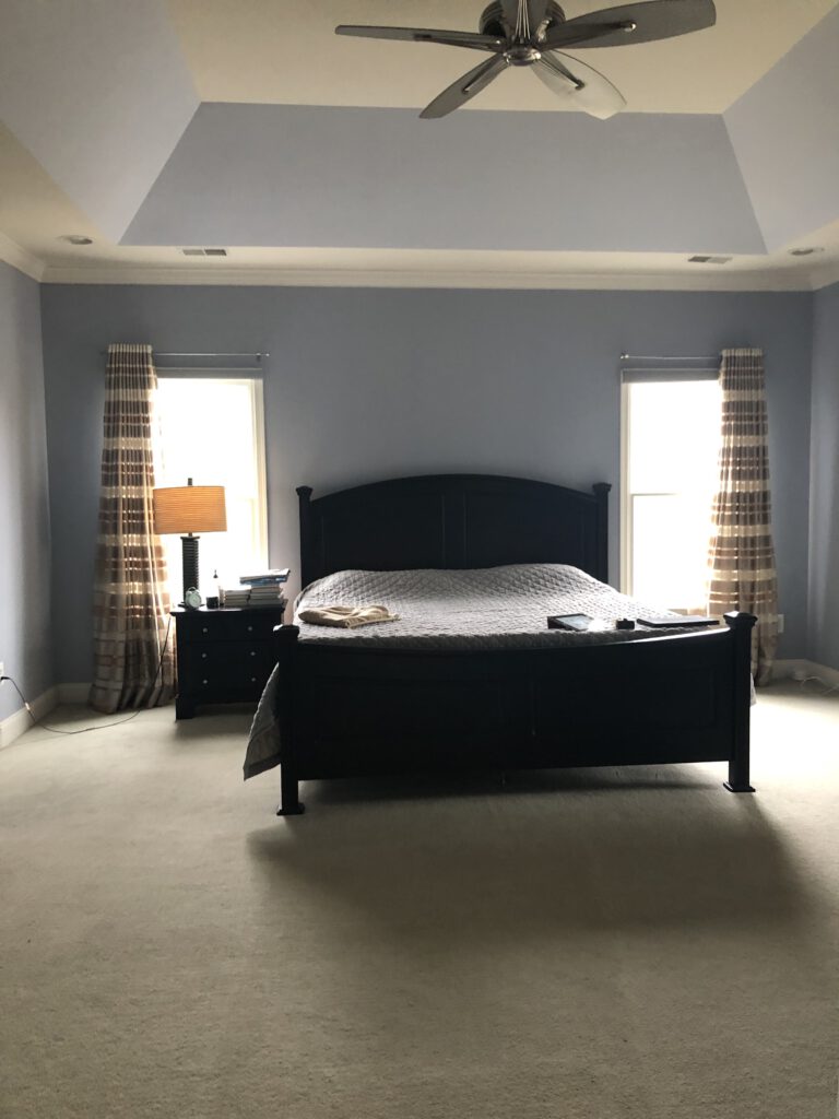
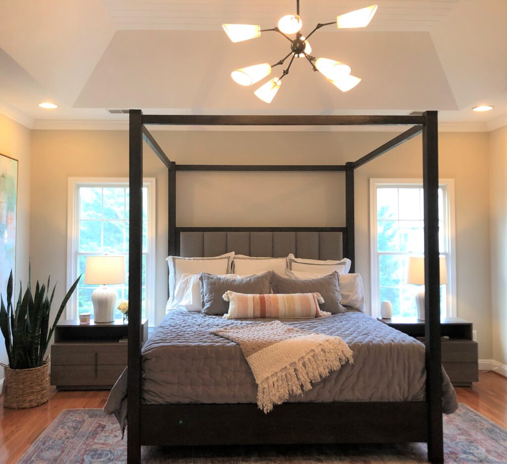
“The room has a tall tray ceiling over the bedroom proper, and I wanted to highlight the element. We added shiplap to the tray ceiling for texture, and the clean-lined poster bed was the perfect fit inside the space. The classic four-poster bed done in a modern way sets the tone for the room. We dressed the bed in crisp white linens with velvet shams and coverlet for softness and texture.”
That’s an interesting light fixture over the bed. What caught your eye there?
“Light fixtures and lamps are a room’s jewelry and a great way to introduce color and texture to a room. This fixture by Hudson Valley Lighting is very mid-century modern and adds great shape to all the straight lines in the room. My client was a little unsure of the choice during the design review, but now loves it.”
You got rid of the regular white bathroom door and replaced it with dark, rolling barn style doors. That’s an interesting choice.
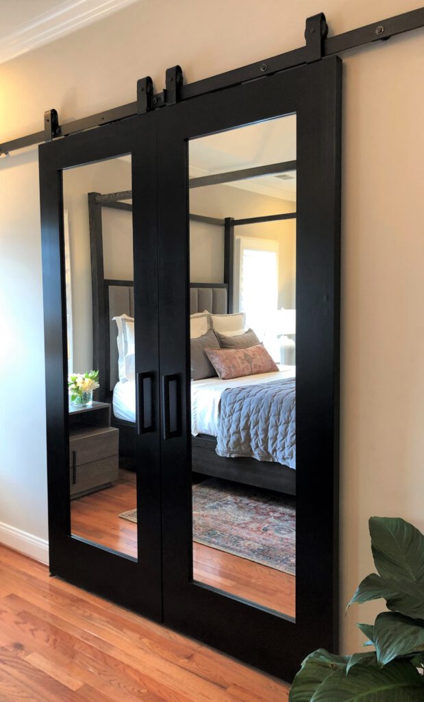
“First, I love to paint doors a bold color. Standard doors can look amazing and transform a space once painted. Second, the bathroom wall was plain and needed something. My original thought was to hang an oversized mirror along the wall to provide reflection, function, and décor. I also wanted to clean up all of the doors in the room — there were too many doors. There were double doors to the bathroom, a door to the closet area, doors to each closet, a door to the exercise room. We removed all of the doors to create a ‘dressing foyer’ while at the same time let in more natural light via the exercise room window. Instead of a single mirror, we added the striking Rustica Hardware double-sided mirrored doors to the bathroom. The doors provide the reflection, function, and décor I was after while reiterating the room’s theme of classic done modern.”
Let’s talk about some of the other decor. I see lots of nature images — the pressed flowers, the potted plants. Even the artwork next to the bed evokes nature — a pond with reeds around it.
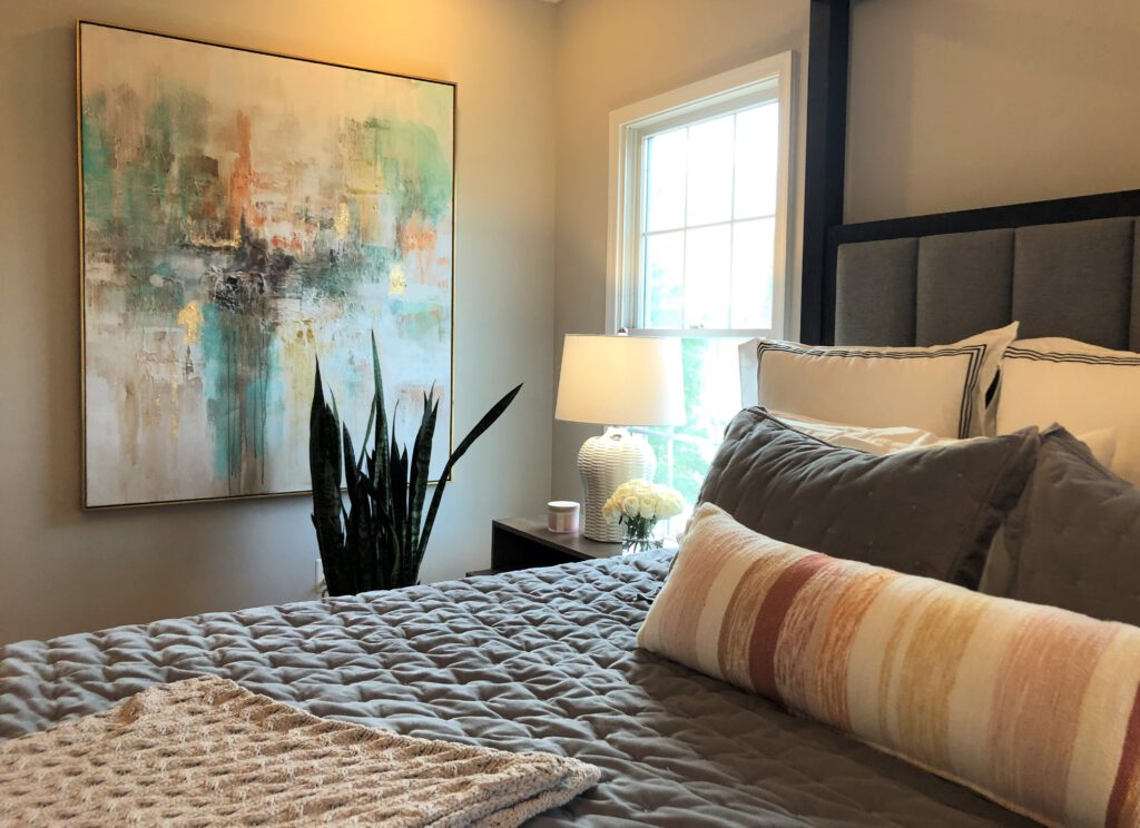
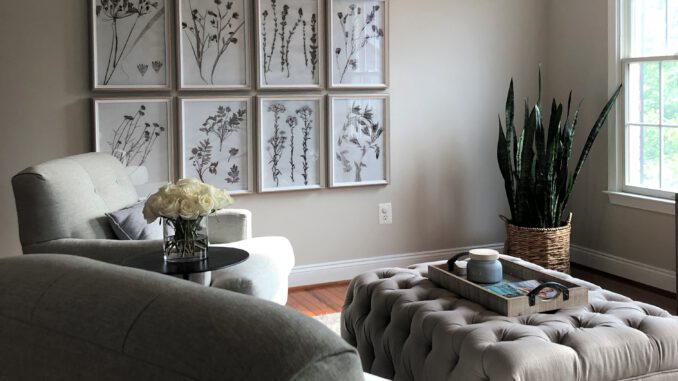
“Yes, I love how you interpret the art. I am really drawn to abstract art as it allows each viewer to interpret it in their own way. The room’s color scheme was set by the art and rugs — blues, corals, and neutral tones. The wall décor reinforced the color scheme and soothing feeling we wanted the room to invoke. I always try to use real plants to provide color, texture, and life to a room. Do not be scared to use real plants — they really do not need much maintenance. Bluemont Nursery is my go-to for plants and great pottery.”

