By Chris Wadsworth
When Marisa Santisi moved into her new home in the Belmont Country Club community 2½ years ago, she loved nearly everything about her new home: the openness of the living areas, the wonderful backyard, even the proximity to great shopping and restaurants. There was just one problem: the kitchen.
“It just wasn’t very functional,” Santisi said. “The island was small and the cooking area was in the island, so that was even less functional. We had wasted space. The cabinets were poor quality. The kitchen was very dark. We wanted to lighten it up.”

Sounds like a kitchen crying out for a makeover, and that’s just what Santisi, her husband, Juan, and their two boys got. The family teamed with designer Sarah Kahn Turner from Jennifer Gilmer Kitchen & Bath. The Maryland-based firm recently opened a new location in the Ashburn Village Shopping Center.
“It was definitely too heavy and builder-grade and dark. It felt like a doctor’s office,” said Turner, referring to the Santisi family’s original kitchen. “I wanted to capture all the wasted floor space, redesign the angles and really open it up and redirect the space.”
There were several main issues to tackle.
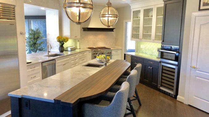
Turner designed a new kitchen that repositioned nearly everything — the island got longer and switched positions. The refrigerator moved to a better location. A wall was extended, and the pass-through to the sun room widened by 3 feet to allow more natural light.
Turner also focused on how the Santisis would use their kitchen, adding storage for items near where they would be needed and creating a work flow from food storage areas to prep areas to cooking areas.
“There are a lot of cookie-cutter floor plans out there, but they don’t have to be,” Turner said. “[Builders] make spaces so large, but … I don’t think they consider how people are going to actually use the kitchen. They just want to fill it.”
Besides the structure and layout of the kitchen, much attention was given to the aesthetics — the materials used and the colors chosen.
Take the large center island for example — one half is a natural silvery quartzite, while the other half is an oiled, food-safe African wenge wood.
“The contrast of the surfaces gives it a lot of character,” Santisi said. “Having the natural wood gives it a very nice touch versus having it all white.”
Light kitchens with white cabinets are popular, but Turner threw in a twist to make the Santisis’ kitchen pop.
“We changed all the cabinet finishes to white, but we darkened the floor,” she said. The existing hardwood was sanded and refinished with a Jacob Bean stain. “It helped anchor the floor and emphasize the ceiling height.”
Marisa Santisi is thrilled with her new kitchen and she shared her two big takeaways — advice she would give others undertaking a kitchen makeover:
- Seriously consider using a professional designer. “Even if you know what color cabinets you like or what surfaces you want, they know how to utilize the space much better than you.”
- Think about how many years you want this kitchen to last because some styles may not age well (wood paneling and shag carpeting come to mind). “I wanted to go completely modern, but [Turner] was able to explain how going to extremes on the modern side would actually make the kitchen outdated faster.”
